Namkos Progress Bar: Colour Templates & Custom Design
Namkos Team

Summary: Namkos Progress Bar ships with ready-to-use colour templates for every season and brand aesthetic, plus a fully custom design mode. This guide walks through every template, explains when to use each one, and shows you how to build a completely custom look with a video walkthrough.
Your progress bar should look like it was built for your store, not bolted on. A bar that clashes with your brand colours feels cheap. A bar that blends in builds trust and keeps customers focused on one thing: reaching their reward.
Namkos Progress Bar makes this easy. Choose from ready-made colour templates that cover everything from seasonal promotions to minimal everyday aesthetics. Or go fully custom and control every detail, from typography to gradient backgrounds to the progress track itself.
This guide covers every template, when to use each one, and how to create a custom design that matches your brand perfectly.
What You Will Learn
📌 Every colour template available in Namkos Progress Bar and what each looks like
📌 Which templates to use for seasonal promotions versus everyday branding
📌 How to build a fully custom design using the styling panel
📌 Tips for choosing the right look for your store
Free plan available • No credit card required • Setup in minutes
Why Styling Your Progress Bar Matters
A progress bar colour template is a pre-built set of colours, gradients, and styling options that you can apply to your Shopify progress bar in a single click. Instead of manually picking hex codes for the background, progress track, text, and close button, a template sets all of these at once to create a cohesive, professional look that matches a specific brand aesthetic or seasonal promotion.
A progress bar that does not match your store's look creates friction. Customers notice when something feels out of place, even if they cannot pinpoint why. That small moment of visual disconnect can reduce trust and distract from the message.
On the other hand, a progress bar that matches your brand palette and typography feels intentional. It reinforces your store's identity and keeps the focus on the reward: free shipping, a discount, or a free gift.
Styling is not just cosmetic. It is part of the conversion. A well-designed bar earns attention without demanding it.
All Colour Templates at a Glance
Namkos Progress Bar includes colour templates ready to use straight from the Styling tab. Each one sets the background, progress track, text colour, and close button styling in a single click.
| Template | Best For | Mood |
|---|---|---|
| Christmas Magic | Holiday season promotions | Festive, warm reds and greens |
| Winter Frost | January and February sales | Cool, crisp blues and whites |
| Summer Breeze | Summer collections and sales | Light, airy pastels |
| Autumn Harvest | Fall launches and Thanksgiving | Warm oranges and earth tones |
| Spring Bloom | Spring arrivals and Easter | Fresh greens and soft pinks |
| Ocean Deep | Outdoor, surf, and lifestyle brands | Deep blues and teals |
| Sunset Glow | Warm-toned brands and summer events | Oranges and golden hues |
| Forest Green | Eco-friendly and natural product stores | Rich greens and earth tones |
| Midnight Dark | Luxury, tech, and minimalist brands | Dark backgrounds, high contrast |
| Cotton Candy | Playful, feminine, and beauty brands | Soft pinks and purples |
| Lava Flow | Bold sales and clearance events | Intense reds and dark gradients |
| Arctic Ice | Clean, clinical, and health brands | Icy blues and white |
| Tropical Paradise | Resort, travel, and swimwear stores | Vibrant greens and teals |
| Vintage Rose | Boutique, handmade, and gift shops | Muted pinks and antique tones |
| Neon Lights | Streetwear, gaming, and youth brands | Bright, electric colours |
| Black Friday | Black Friday sales events | High-contrast black and gold |
| Cyber Monday | Cyber Monday and tech deals | Techy blues and neon accents |
To apply any template, open your promotion in the Namkos Progress Bar dashboard, navigate to the Styling tab, and select the template from the Colour Template dropdown. The preview on the right updates instantly so you can see exactly how it looks before saving.
Seasonal Templates
Five templates are designed specifically for seasonal campaigns. Swap them in when the season changes, then switch back to your everyday template when the promotion ends.
Christmas Magic
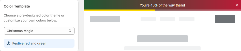
Rich reds, deep greens, and warm gold accents. Use this for any holiday promotion from late November through December. It pairs well with free gift reward types and holiday-themed messaging like "Add $20 more for a free holiday gift."
Winter Frost
Cool blues and crisp whites that feel clean and fresh. Ideal for January sales, winter clearance, and New Year promotions. Works well with discount reward types: "You're $15 away from 10% off your order."
Summer Breeze
Light pastels and airy gradients that match the energy of summer collections. Use for summer sales, beach-themed promotions, or anytime your store needs a lighter feel.
Autumn Harvest
Warm oranges, burnt umber, and earth tones. Perfect for fall product launches, Thanksgiving promotions, and back-to-school campaigns.
Spring Bloom
Fresh greens and soft pinks that signal new arrivals. Use for spring launches, Easter promotions, and any "fresh start" messaging.
Tip: Set a calendar reminder to swap your seasonal template at the start of each season. A bar that matches the current season feels current and intentional.
Everyday Brand Templates
These templates are designed for year-round use. Pick the one that best matches your store's personality and leave it running.
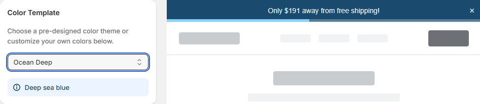
Ocean Deep works for outdoor, surf, and lifestyle brands. Deep blues and teals feel calm and trustworthy.
Sunset Glow brings warmth with oranges and golden hues. Suits brands that want an inviting, approachable feel.
Forest Green is the go-to for eco-friendly, organic, and natural product stores. Rich greens reinforce the "natural" positioning.
Midnight Dark is built for luxury, tech, and minimalist stores. Dark backgrounds with high-contrast text feel premium and clean.
Cotton Candy uses soft pinks and purples for playful, feminine, and beauty brands. It is inviting without being overwhelming.
Lava Flow is bold and intense with deep reds and dark gradients. Use it for clearance events, flash sales, or any time you want to create urgency.
Arctic Ice delivers icy blues and white for clean, clinical aesthetics. Health, wellness, and skincare brands often find this one fits perfectly.
Tropical Paradise brings vibrant greens and teals for resort, travel, and swimwear stores. It feels energetic and fun.
Vintage Rose uses muted pinks and antique tones for boutiques, handmade goods, and gift shops. It feels curated and personal.
Neon Lights goes electric with bright, high-energy colours. Streetwear, gaming, and youth-focused brands can use this to match their bold aesthetics.
Sales Event Templates
Two templates are built specifically for the biggest sales events of the year.
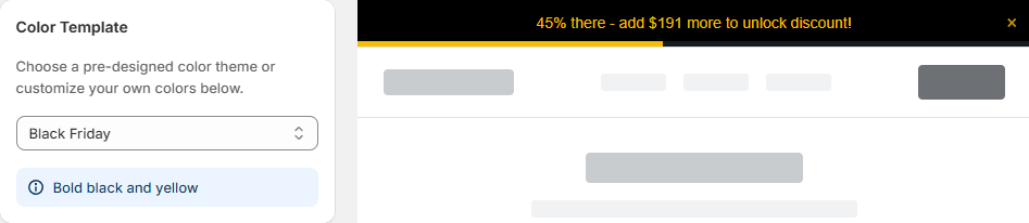
Black Friday uses high-contrast black backgrounds with gold accents. It immediately signals "major sale" and pairs perfectly with aggressive reward messaging: "Spend $75 for 15% off your entire order."
Cyber Monday leans into techy blues and neon accents. It complements the digital-first feel of Cyber Monday promotions and works especially well with dollar-amount discount rewards.
Tip: Switch to Black Friday or Cyber Monday templates a few days before the event starts. Customers recognise the visual shift and it creates anticipation.
Custom Design: Build Your Own Look
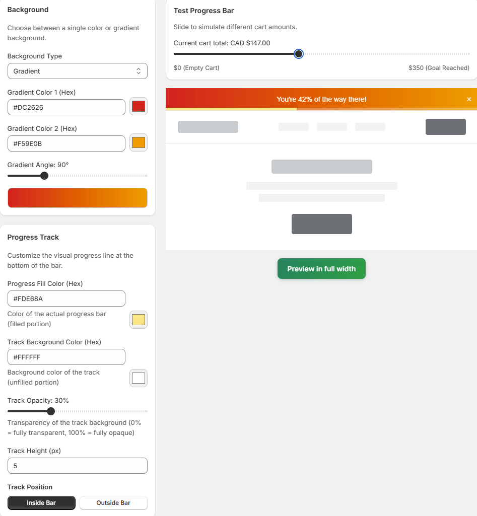
If none of the templates match your brand exactly, the Custom option gives you full control. Select Custom from the Colour Template dropdown and the styling panel expands to show every configurable property.
Here is what you can customise:
Background
Set a solid colour or a gradient background for the entire bar. Gradients let you create depth and visual interest. Match your store's header or footer colour for a seamless look.
Progress Track
The progress track is the visual fill that moves from left to right as customers add items. You can set both the track colour (the filled portion) and the background track colour (the unfilled portion). High contrast between the two makes progress feel more satisfying.
Typography
Control the text colour, font weight, and size. Keep text readable against your chosen background. White text on dark backgrounds and dark text on light backgrounds are the safest choices.
Close Button
Style the close button (the "x" that lets customers dismiss the bar) so it blends with your design rather than standing out awkwardly.
Live Preview
Every change you make updates the preview panel on the right side of the dashboard in real time. Use the Test Progress Bar slider to simulate different cart amounts and see how the bar looks at 0%, 50%, and 100% progress. Click Preview in full width to see exactly how the bar will appear on your live store.
Video Walkthrough: Applying and Previewing Templates
The video below walks through the Styling tab inside the Namkos Progress Bar dashboard. Watch to see each template in action and learn how to switch between templates, preview changes, and apply custom styling.
For the full video tutorial series covering every feature of Namkos Progress Bar, visit our complete video tutorial hub.
Tips for Choosing the Right Template
1. Match your store's primary brand colour. If your store uses blue tones, start with Ocean Deep or Arctic Ice. If it leans warm, try Sunset Glow or Autumn Harvest. The closer the bar matches your existing palette, the more natural it feels.
2. Rotate templates with the seasons. Swapping to a seasonal template takes seconds and keeps your store feeling fresh. Customers notice when a store updates its look, and it signals that you are active and paying attention.
3. Always preview on mobile. Most Shopify traffic comes from mobile devices. Use the preview panel to check that text remains readable and the bar does not feel too tall or cramped on smaller screens.
4. Use the full-width preview. The sidebar preview is helpful for quick checks, but the Preview in full width button shows you exactly how the bar will render on your actual store layout. Always check this before saving.
5. Match the template to the reward type. Bold templates like Lava Flow and Black Friday work well with discount and sale messaging. Softer templates like Cotton Candy and Vintage Rose suit free gift and loyalty-style rewards.
If you are just getting started and have not set up your first progress bar yet, our step-by-step setup guide walks you through the entire process from installation to your first live promotion.
Frequently Asked Questions
Can I change the colour template after my promotion is live? Yes. You can switch templates or update custom styling at any time from the Styling tab. Changes apply immediately to your live store.
Do colour templates affect the Product Page and Cart Page components too? The Styling tab controls the Top/Bottom Bar appearance. Product Page and Cart Page components have their own styling options within their respective tabs, so you can match or differentiate as needed.
Does changing templates affect performance or page speed? No. All templates are pure CSS styling applied to the same lightweight component. Switching templates does not add any extra code or scripts to your store. Namkos Progress Bar is designed to be performance-minded and Core Web Vitals friendly.
Can I save a custom design and reuse it across promotions? Each promotion stores its own styling settings. If you want the same custom look across multiple promotions, you can duplicate a promotion from the dashboard, which copies all styling along with the content settings.
Is the Custom option available on the free plan? Yes. Both colour templates and full custom styling are available on the free plan for the Top/Bottom Bar component.
Free plan available • No credit card required • Setup in minutes