New in Namkos Progress Bar: Custom Fonts & Letter Spacing
Namkos Team
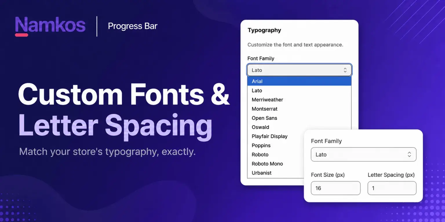
Summary: Namkos Progress Bar just got a typography upgrade. The Font Family menu now offers 11 curated, self-hosted typefaces, and a new Letter Spacing control lets you fine-tune the text from -1px to 4px. Both work with a live preview, both are on the free plan, and neither adds weight to your store.
Typography is one of those details customers never mention but always feel. When your progress bar uses the same typeface as the rest of your store, it reads as part of the design. When it does not, it looks bolted on.
Until now, Namkos Progress Bar leaned on a short list of web-safe system fonts. They were safe, but they were also generic, and they rendered slightly differently on every device. This update fixes that. You now get a curated library of self-hosted fonts and precise control over letter spacing, so the bar can match your brand instead of fighting it.
What You Will Learn
📌 Every font now available in the Namkos Progress Bar Font Family menu
📌 What the new Letter Spacing control does and when to use it
📌 Why self-hosted fonts keep your store fast and consistent
📌 How to change your font and spacing step by step with a live preview
Free plan available • No credit card required • Setup in minutes
The Typography Update in Brief
Two changes landed in the Styling tab:
- A rebuilt Font Family menu. Eleven typefaces, chosen to cover the common brand styles Shopify merchants actually use. Ten of them are self-hosted by the app, so they look identical on every visitor's screen. Arial stays as the universal system default.
- A Letter Spacing control. A single numeric field that tightens or opens up the space between characters, from -1px to 4px, in steps of 0.1px.
Both settings update the live preview on the right side of the dashboard as you change them, so you never have to save and check your storefront to see the result.
The New Font Library
The Font Family dropdown now groups a practical mix of sans-serif, serif, display, and monospace options. Here is the full list and where each one tends to fit.
| Font | Style | Works well for |
|---|---|---|
| Arial | Sans-serif (system) | Universal default, safe fallback on any device |
| Lato | Sans-serif | Friendly, rounded, general retail |
| Montserrat | Sans-serif | Modern fashion, lifestyle, geometric brands |
| Open Sans | Sans-serif | Clean and neutral, high readability at small sizes |
| Poppins | Sans-serif | Contemporary DTC brands, soft geometric feel |
| Roboto | Sans-serif | Tech, electronics, app-style interfaces |
| Urbanist | Sans-serif | Minimal, design-led stores |
| Merriweather | Serif | Editorial, wellness, premium positioning |
| Playfair Display | Serif | Luxury, beauty, jewellery, elevated aesthetics |
| Oswald | Display | Bold sale messaging, streetwear, sport |
| Roboto Mono | Monospace | Techy, developer-focused, or novelty branding |
The goal is not to have hundreds of fonts. It is to have a curated set that matches the way most Shopify themes are built, so your bar sits naturally next to your header, buttons, and product text.
Why Self-Hosted Fonts Matter
Every font except Arial is bundled with the app and served from Namkos. That has three practical benefits for your store.
Consistency across devices. A visitor on an old Android phone and a visitor on a new Mac see the same typeface. System fonts render differently depending on what the operating system has installed, which is why a bar can look right on your machine and off on a customer's.
No third-party font requests. The bar does not call out to an external font service on page load. That is one less connection, one less point of failure, and it keeps the component aligned with a mobile-first, Core Web Vitals friendly approach.
No layout shift. The moment you open the Font Family menu, the app quietly preloads the font files. By the time you pick one, it is usually already cached, so the preview swaps in cleanly instead of flashing. On your live store, the fonts load with a swap strategy so text is always visible.
Namkos Progress Bar is built to stay lightweight. Adding real typography control should not come at the cost of speed, and it does not here.
Letter Spacing: A Small Control With a Big Effect
Letter spacing, sometimes called tracking, is the amount of space between each character. It sounds minor, but it changes how a short line of text feels.
The new control accepts a value from -1px to 4px:
- Negative values (-1px to 0px) pull letters closer together. This suits large, bold headings and condensed fonts like Oswald, where tighter spacing looks deliberate and punchy.
- Zero is the font's natural spacing and the right starting point for most bars.
- Positive values (0.5px to 2px) open the text up. A little extra spacing on all-caps messaging, such as "ONLY $12 AWAY FROM FREE SHIPPING", makes it easier to read and feels more premium.
- Higher values (2px to 4px) create a spaced-out, editorial look. Use sparingly, and only on very short messages, because too much spacing hurts readability.
As with the font menu, the preview updates instantly. Nudge the value up and down by 0.1px and watch the bar until the text sits the way you want.
Where You Can Use These Controls
Both font family and letter spacing are available across all three Namkos Progress Bar components.
| Component | Plan | Typography control |
|---|---|---|
| Top/Bottom Bar | Free | Font and letter spacing on the bar message text |
| Product Page Bar | Free (upsell cards: Growth or Scale) | Separate font and spacing for bar text, product name, price, and the add-to-cart button |
| Cart Page Bar | Free (upsell cards: Growth or Scale) | Separate font and spacing for bar text, product name, price, and the add-to-cart button |
On the Product Page and Cart Page components, giving each element its own typography settings means you can, for example, keep the bar message in your body font while setting the upsell price in something bolder.
How to Change Your Font and Letter Spacing
- Open your promotion in the Namkos Progress Bar dashboard and go to the Styling tab.
- Find the Text Styling section.
- Open the Font Family dropdown and choose a typeface. The preview updates right away.
- In the Letter Spacing (px) field, enter a value between -1 and 4. Start at 0 and adjust in small steps.
- Check the preview at different cart amounts using the test slider, then click Preview in full width to see it on your real store layout.
- Save. Changes apply to your live store immediately.
If you have not built your first bar yet, the step-by-step setup guide covers installation through to your first live promotion. For the full picture on colours and custom design, see the colour templates and custom design guide.
Typography Tips for Your Progress Bar
Match your theme, do not compete with it. Open your store, note the font used for headings and buttons, and pick the closest option from the menu. Montserrat, Poppins, and Open Sans cover a large share of modern Shopify themes.
Keep serif fonts for premium contexts. Playfair Display and Merriweather look excellent on beauty, jewellery, and wellness stores. On a high-volume discount store they can feel out of place.
Test all-caps messaging with a touch of spacing. If your bar text is uppercase, try 0.5px to 1px of letter spacing. It almost always reads better.
Always check mobile. Most Shopify traffic is mobile. Use the preview to confirm the text stays on one line and remains readable at a smaller size.
Change one thing at a time. Switch the font, look. Adjust spacing, look. Small, deliberate changes are easier to judge than several at once.
Frequently Asked Questions
Are the new fonts available on the free plan? Yes. The Top/Bottom Bar, Product Page and Cart Page components all include the full Font Family menu and the Letter Spacing control on the free plan. The upsell product cards need Growth or Scale.
Will self-hosted fonts slow down my store?
No. The fonts are lightweight woff2 files served with the component, with no external font service request. They load with a swap strategy so text is always visible, and the app preloads them in the dashboard to avoid a visible flash. Results vary based on theme, traffic, and execution, but the component is built to stay Core Web Vitals friendly.
Can I set different fonts for different parts of the bar? On the Product Page and Cart Page components, yes. The bar text, product name, price, and add-to-cart button each have their own font and letter spacing settings. The Top/Bottom Bar applies one font to the message text.
What letter spacing value should I start with? Start at 0, which is the font's natural spacing. Only adjust if the text looks too tight or too loose. For all-caps messages, 0.5px to 1px usually helps.
Do I need to reinstall or update anything? No. The new options appear automatically in the Styling tab. Open a promotion, choose a font, set your spacing, and save.
Free plan available • No credit card required • Setup in minutes